Style & Context
Influences
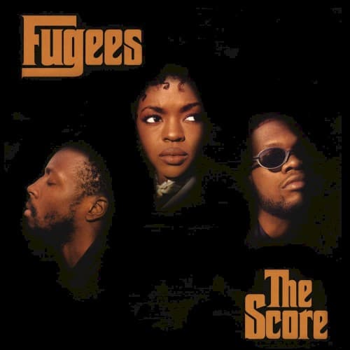
Film noir, 1970s soul album portraits, Blue Note-style cover typography
Location
Rough edges and darkness give the portrait a gritty, street-level edge.
Visual Language
Faces are lit selectively and the edges burn out to black, turning a group photo into a stage spotlight.
Symbols
Three floating faces
Each member appears detached from any body, suggesting a trio defined by voice and presence rather than posturing.
Black void
The empty darkness removes any location, letting the group stand outside a specific borough, era or rap faction.
Amber serif lettering
Heavy warm-toned letters in a retro slab style recall film titles, matching the cinematic wordplay of The Score.
Where Sound Meets Image
The dark, soulful frame suits an album that moves between the reggae-tinged bounce of Fu-Gee-La, the haunting cover of Killing Me Softly and the brooding Ready or Not. Spotlit faces mirror how the three voices trade lead roles, each stepping out of the shadows in turn. The warm lettering echoes the live-band, sample-rich warmth of the production.
The cover set a template for stripped-back, portrait-first rap packaging that put faces and voices ahead of flash. Its amber-on-black look has been echoed by neo-soul and alternative hip-hop sleeves ever since.