Style & Context
Influences
documentary realism, Boyz n the Hood cinematography, 1990s hood film aesthetics
Location
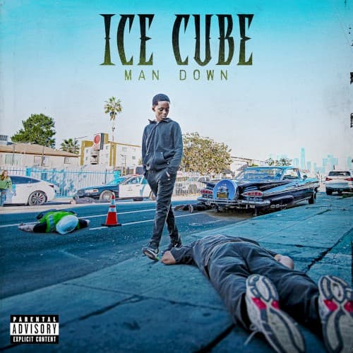
The residential street with its palm trees, stucco homes, and lowriders is unmistakably South Central Los Angeles territory.
Visual Language
The composition uses naturalistic lighting and real locations to create authenticity that recalls early 90s South Central visual documentation.
Symbols
Body on the pavement
The fallen figure represents gang violence's ongoing cycle and Cube's literal position of survival over those who didn't make it.
Traffic cone and debris
These mundane street fixtures transform an everyday LA block into an active crime scene frozen in time.
Classic lowrider in background
The pristine blue vintage car symbolizes West Coast heritage and the neighborhood's cultural pride persisting despite violence.
Where Sound Meets Image
The album title Man Down gets literal visual translation, with Cube positioned as the last man standing in a conflict that's claimed another victim. His expression shows no triumph, just weary acknowledgment of street reality. This visual directly supports the album's return to street reporting and social commentary that built his career. The West Coast setting and g-funk era lowrider connect to the boom bap and gangsta rap sound, while the contemporary staging shows these aren't nostalgic war stories but present-day dispatches from neighborhoods where the war never ended.
This cover joins a lineage of unflinching hip-hop imagery that refuses to sanitize street life, following albums like Nas's Illmatic and Kendrick's good kid, m.A.A.d city in documenting rather than glorifying. By placing himself physically in the scene rather than observing from luxury, Cube reminds younger artists that authenticity means witnessing and reporting, not just flexing distance from struggle. The photojournalistic approach may influence a return to reality-based album art in an era dominated by abstract digital designs.