Style & Context
Influences
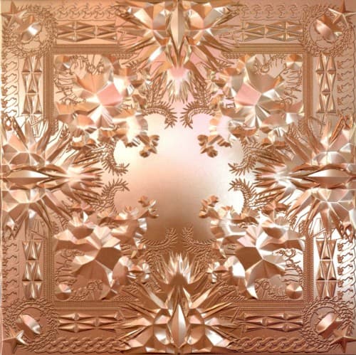
Versailles ceiling frescoes, Romantic painting, luxury fashion branding, Gianni Mora's digital maximalism
Location
This artwork speaks to hip-hop's global reach rather than specific geography, positioning rap as international high culture.
Visual Language
The technique mimics embossed metallic relief, creating dimensionality while maintaining decorative flatness throughout the entire composition.
Symbols
Flying angelic figures
These winged forms represent ascension beyond earthly rap beefs into a stratospheric realm where only kings exist.
Ornate baroque framing
The European palace aesthetic claims Old World aristocracy for New World hip-hop wealth and cultural dominance.
Central radiant void
The glowing empty center suggests either divine light or the absent throne both artists circle and compete for.
Where Sound Meets Image
The ornate maximalism mirrors the album's Lex Luger drums layered with orchestral samples and soul loops, creating sonic palaces to match the visual one. Tracks like Otis and No Church in the Wild stack competing elements into cohesive luxury, just as the cover balances dozens of visual motifs without collapse. The flying figures reflect songs about transcendence and competition, two kings circling the same throne, while the unified color scheme matches their surprising collaborative chemistry throughout the project.
Riccardo Tisci's art direction and Mora's execution established rose gold as hip-hop's luxury metal of choice for years after release. The cover influenced fashion campaigns, concert visuals, and countless album artworks attempting similar digital baroque aesthetics. Its unapologetic opulence validated maximalist design in hip-hop, moving away from minimalist street credibility toward embracing wealth and refinement without apology.