Style & Context
Influences
Afrofuturism, corporate portraiture, album covers from Blue Note jazz records, graphic design minimalism
Location
The stripped-down aesthetic reflects Q-Tip's Queens roots while projecting mature artistry beyond regional hip-hop scenes.
Visual Language
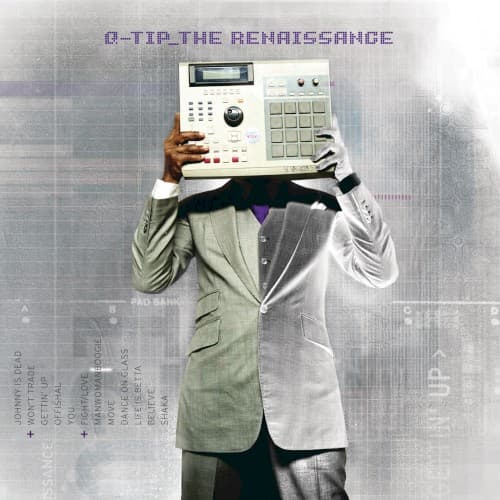
The formal suit portrait gets disrupted by replacing humanity with machinery, creating surreal commentary on artist identity.
Symbols
MPC drum machine as head
Q-Tip's entire identity and consciousness flows through the beat-making tool that defined his career.
Split-tone suit (grey/white)
The duality represents Q-Tip's dual nature as both underground purist and accessible innovator in hip-hop.
Purple tie and text
The royal color announces this comeback album as reclaiming his throne in conscious rap production.
Where Sound Meets Image
The Renaissance features live instrumentation blended with Q-Tip's signature sample chops, and the cover visualizes this hybrid approach—human body representing organic musicianship, machine head representing technical production mastery. The formal presentation matches the album's polished sound, which balances jazz-infused conscious lyrics with radio-friendly production. The desaturated color scheme mirrors the album's reflective, mature tone as Q-Tip contemplates his legacy and place in a changed hip-hop landscape across tracks examining personal growth and industry evolution.
This cover became a template for producer-as-artist album packaging, where the production tools become central visual elements rather than background details. The sampler-as-identity concept influenced how bedroom producers and Instagram beat-makers would later photograph themselves with their equipment as extensions of self. The minimal aesthetic anticipated the stripped-down cover designs that would dominate independent hip-hop releases throughout the 2010s, proving that powerful statements don't require visual excess.