Style & Context
Influences
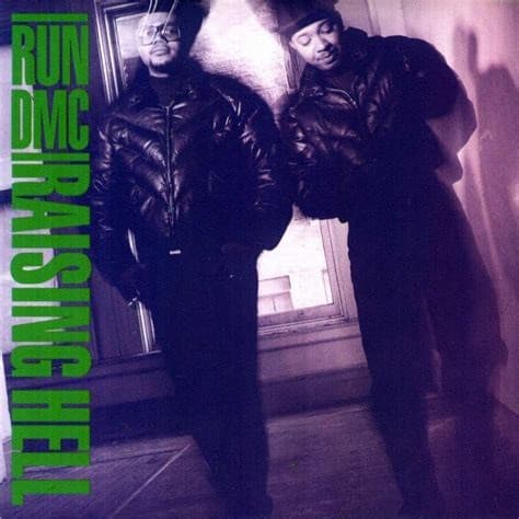
B-boy style documentation, hood portraiture, classic hip-hop press photos
Location
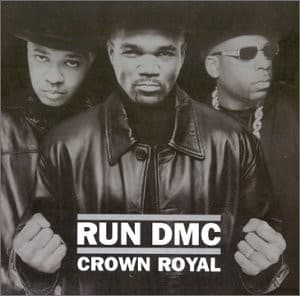
Queens grit is encoded in their stance even though the sterile studio setting erases any geographic specificity.
Visual Language
The straightforward composition echoes their 1980s album covers, rejecting visual innovation for brand consistency and familiarity.
Symbols
Black leather jackets
The uniform represents unwavering loyalty to b-boy culture despite two decades of industry change.
Clenched fists
Defensive posture suggests the group is fighting for relevance in a landscape they pioneered but no longer dominate.
Direct eye contact
Each member locks eyes with the viewer, demanding recognition as architects who built the foundation others now stand on.
Where Sound Meets Image
The visual severity matches an album caught between legacy and desperation. Crown Royal featured everyone from Kid Rock to Sugar Ray, a crossover strategy that contradicted the no-nonsense image projected here. The leather jackets and hard stares promise raw hip-hop fundamentals, but the actual music chased pop-rap trends and radio formats. This disconnect between visual branding and sonic content makes the cover feel like false advertising, a final attempt to leverage their iconography even as the music abandoned their sonic principles.
This cover reinforced Run-DMC's visual vocabulary one last time before Jam Master Jay's murder eight months after release turned it into an accidental memorial. The image codified their place as hip-hop's first great visual brand—the group that proved rap acts needed signature looks as much as signature sounds. While not visually innovative, it documented how the architects of hip-hop's crossover appeal looked when the culture they built had moved beyond them.