Style & Context
Influences
Underground comix, psychedelic poster art, Saturday morning cartoons, graffiti aesthetics
Location
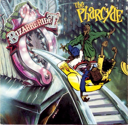
The South Central setting visible in background architecture contrasts sharply with the fantastical foreground action and thematic content.
Visual Language
The exaggerated proportions and motion lines borrow from animation tradition while the color rendering suggests '70s blacksploitation poster techniques.
Symbols
Bizarre Ride attraction
The distorted amusement park ride represents the group's twisted, unconventional approach to hip-hop storytelling and consciousness.
Falling/flying figures
Members caught mid-motion symbolize the album's themes of being young, lost, and navigating life's disorienting journey.
Urban skyline background
Gray city buildings ground the surrealism in South Central Los Angeles reality, refusing complete escapism from their environment.
Where Sound Meets Image
The cover's chaotic energy mirrors the album's sample-heavy production and the group's overlapping, conversational vocal style. Tracks like 'Passing Me By' and 'Ya Mama' match the visual's blend of humor and melancholy, while the illustrated figures' exaggerated features echo the members' distinctive, character-driven delivery. The bizarre ride itself functions as the perfect visual metaphor for the album's jazz-inflected boom bap—unpredictable, dizzying, and refusing to follow conventional West Coast formulas.
This cover helped establish that West Coast hip-hop could embrace whimsy and abstraction without sacrificing authenticity. The illustration style influenced later alternative rap visuals, particularly for artists blending conscious lyrics with playful production. Delicious Vinyl's willingness to commission this departure from photographic realism opened doors for more experimental hip-hop packaging throughout the '90s.