Style & Context
Influences
Black Panther Party imagery, guerrilla journalism, punk rock DIY aesthetics, political poster art
Location
This visual language spoke directly to Black youth in Oakland and beyond who saw their daily reality ignored by mainstream media.
Visual Language
The deliberately rough production quality rejects commercial polish in favor of authenticity that matches the album's uncompromising political stance.
Symbols
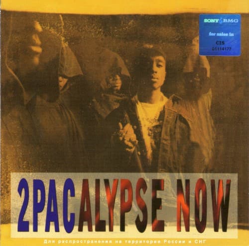
Sepia photo treatment
The archival quality positions 2Pac's street journalism as historical documentation worth preserving for future generations.
Fragmented typography
The broken lettering in '2PACALYPSE NOW' mirrors a society fractured by systemic violence and racial inequality.
Crew positioning
Multiple figures clustered together emphasize collective struggle over individual stardom, reflecting the album's community-focused politics.
Where Sound Meets Image
The grainy, unpolished visual perfectly mirrors the album's raw production and unfiltered storytelling about police harassment, poverty, and systemic racism. Just as tracks like 'Trapped' and 'Brenda's Got a Baby' refuse to sanitize street realities, the cover rejects glossy commercial presentation. The fragmented typography echoes the album's disjointed social fabric—communities torn apart by forces 2Pac documents with journalistic precision. The crew shot reflects the collective consciousness throughout the album, where individual stories represent broader community struggles.
This cover established the template for conscious rap aesthetics—prioritizing authenticity over commercial appeal and documentary truth over fantasy. Its influence appears in subsequent political hip-hop releases that chose raw photography over styled shoots, from dead prez to Kendrick Lamar's early mixtapes. The fragmented typography style became shorthand for socially conscious rap, signaling serious content within. Most significantly, it proved debut albums could make bold visual statements about political identity, paving the way for hip-hop as vehicle for social documentation.