Style & Context
Influences
Constructivism, Op Art, bold modernist graphic design, early 2000s digital maximalism
Location
The cover reflects the Thornton brothers' Virginia Beach perspective colliding with commercial major label expectations and polish.
Visual Language
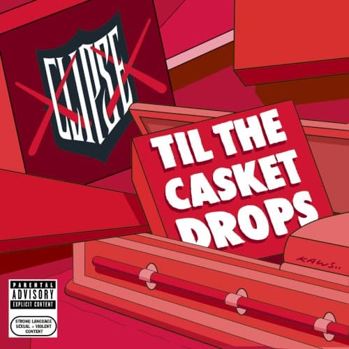
The clean vector geometry creates stark visual impact while maintaining the polish expected from a major label release.
Symbols
Casket handles
The three brass handles represent death's constant presence in the drug trade Clipse chronicles throughout their music.
Shattered geometric planes
The fragmented red panels symbolize fractured lives and the structural collapse of communities devastated by crack cocaine.
Sharp angular lines
The jagged edges cutting through the composition mirror the violent ruptures and betrayals endemic to street hustling.
Where Sound Meets Image
The fractured visual chaos mirrors the album's exploration of psychological fracture under the weight of drug dealing consequences. Songs like 'I'm Good' and 'Freedom' grapple with the toll of street life, and the shattered red panels visualize that internal conflict. The casket handles aren't subtle—they're a blunt reminder of where these narratives inevitably lead, matching the Thornton brothers' unflinching lyrical approach to depicting the game's darker realities.
The cover helped establish a visual vocabulary for representing psychological weight in street rap artwork during the late 2000s transition period. Its geometric approach influenced how labels marketed conscious street rappers who refused to romanticize drug dealing, balancing commercial polish with thematic darkness. The bold typography treatment became a template for hip-hop covers trying to stand out in iTunes thumbnails.