Style & Context
Influences
diary photography, bedroom studio documentation, southern domestic realism
Location
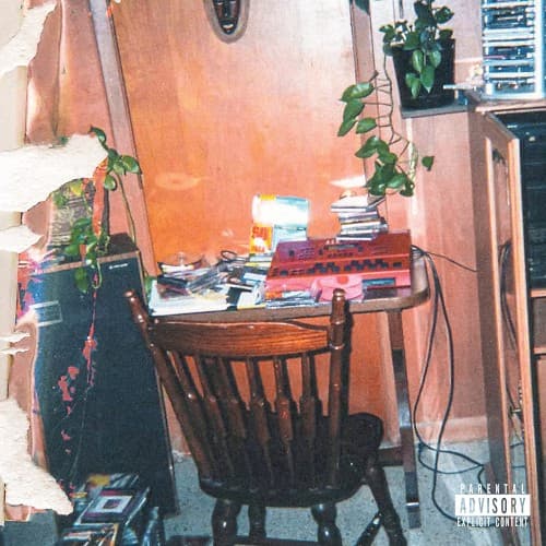
The modest bedroom setup reflects middle-class Black creative spaces where East Coast intellect meets southern introspection.
Visual Language
The grainy snapshot aesthetic rejects polish for raw authenticity, aligning with conscious rap's truth-telling ethos.
Symbols
Peeling paint layers
The wall's physical decay mirrors the album title's suggestion of falling off the pedestal of success.
Hanging plants
Green life persists in deteriorating space, representing creative resilience amid career doubts and industry pressures.
Wooden chair facing wall
The empty seat symbolizes the lonely creative process and the weight of expectations facing conscious rappers.
Where Sound Meets Image
The deteriorating wall literalizes the album title's central anxiety about artistic decline and cultural irrelevance. If the project explores themes of creative burnout, industry disillusionment, or the pressure to maintain platinum status while staying true to conscious rap's mission, this cramped workspace visualizes that tension. The plants suggest growth is still possible even in decay, potentially mirroring any redemptive or resilient themes in the music. The stacks of physical media reference boom bap and soul rap's sample-digging culture.
This cover continues hip-hop's recent embrace of unvarnished domestic photography over staged luxury imagery. The focus on creative spaces rather than personas influenced how artists document their process visually. The peeling paint became a visual shorthand for authenticity versus facade in post-2020 rap aesthetics, encouraging artists to show the unglamorous labor behind the music rather than just the triumph.