Style & Context
Influences
punk zine graphics, Afrofuturist portraiture, DIY political poster art
Location
This reflects Brooklyn's mid-2000s alternative hip-hop scene that prioritized substance over commercial shine and artistic freedom over label politics.
Visual Language
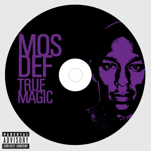
The rough halftone treatment of Mos's face borrows from protest art and underground publishing rather than glossy hip-hop imagery.
Symbols
Purple facial rendering
The color choice connects to Black spiritual traditions and alternative consciousness, positioning Mos as truth-seeker rather than entertainer.
CD disc format
The physical disc design emphasizes the album's rushed, contractual-obligation origins during hip-hop's digital transition era.
Direct eye contact
Mos stares directly at the viewer without smile or performance, demanding accountability rather than offering escapist entertainment.
Where Sound Meets Image
The visual austerity matches the album's lo-fi production and incomplete feel — Mos released these tracks to fulfill contractual obligations rather than as a polished artistic statement. The purple glow suggests the mystical and abstract qualities in his rhymes, while the stark presentation mirrors the stripped-down beats and raw vocal delivery throughout. The direct gaze reflects the uncompromising lyrical content that prioritizes message over mainstream palatability, much like the cover prioritizes impact over commercial appeal.
This cover influenced how independent and alternative hip-hop artists approached major label releases, showing that minimal budgets and rushed timelines could be reframed as aesthetic choices. The stark, protest-poster approach anticipated hip-hop's later embrace of punk and DIY visual languages when artists wanted to signal authenticity over polish. It remains a reference point for artists using visual simplicity to communicate artistic integrity and label resistance.