Style & Context
Influences
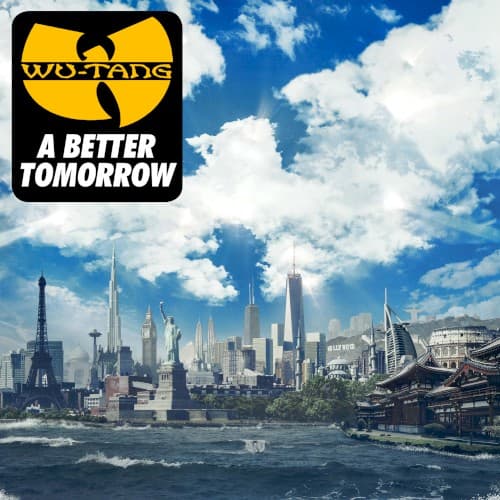
Futurism, architectural visualization, science fiction cityscapes, optimistic retrofuturism
Location
The shift from Shaolin's projects to a borderless world city mirrors the group's geographic and commercial expansion beyond their origins.
Visual Language
The polished digital composition feels closer to concept art for a science fiction film than traditional hip-hop cover photography.
Symbols
Composite global skyline
The impossible blend of world landmarks represents Wu-Tang's evolution from Staten Island warriors to international cultural ambassadors.
Statue of Liberty placement
Liberty stands among international monuments, suggesting freedom and American ideals coexist with global perspectives in the Clan's worldview.
Crystal-clear sky and clouds
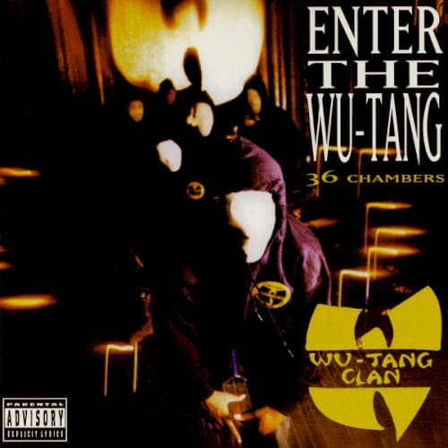
The unusually pristine atmosphere contrasts sharply with the polluted, chaotic New York imagery of their earlier covers.
Where Sound Meets Image
The album tackled social issues and unity among the Clan's members, with RZA guiding the project toward conscious themes about building community and overcoming conflict. The pristine, almost utopian skyline mirrors these aspirational lyrics, though some felt the music itself struggled to match the cover's lofty vision. Where earlier Wu-Tang covers reflected the chaos and darkness of their sound, this one promises enlightenment and progress—a visual representation of veterans trying to offer wisdom rather than warfare.
This cover marked a divisive moment in Wu-Tang's visual identity, showing how legacy acts navigate relevance versus authenticity. While it didn't spawn imitators like 36 Chambers' aesthetic did, it represents the challenge of maintaining street credibility while evolving past your origins. The approach influenced other veteran groups considering how to visually communicate growth without alienating core audiences, though few followed this particular path of digital utopianism.