Style & Context
Influences
Swiss modernism, Helvetica minimalism, zine culture, post-punk DIY aesthetics
Location
Backwoodz Studioz operates outside major label systems, and this cover signals allegiance to independent distribution networks.
Visual Language
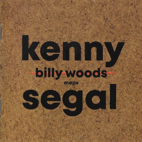
The cover borrows from institutional signage and radical pamphlet design, stripping ornamentation to foreground information density.
Symbols
Cork board texture
The porous surface references community boards where underground shows get posted, positioning woods in grassroots tradition.
Kenny Segal production credit placement
Segal's name sits above the title like a collaborative stamp, honoring producer partnerships in experimental rap.
Lowercase 'maps' while names uppercase
The title's diminutive treatment suggests maps as tools or process rather than destination or product.
Where Sound Meets Image
The cover's textural warmth balances woods' oblique, often harrowing storytelling. Cork's porous surface mirrors how Segal's jazz-inflected production creates breathing room within woods' dense verse structures. The stripped design reflects the album's refusal to guide listeners—like maps requiring interpretation, woods presents coordinates without destinations. The institutional typography matches the album's exploration of systems, surveillance, and documentation, while the material texture grounds abstract concepts in physical reality.
Maps extends underground hip-hop's tradition of anti-commercial packaging, influencing how experimental artists signal artistic seriousness through design restraint. The cover's archival quality positions woods' work as historical document, contributing to conversations about hip-hop's institutional preservation. This approach has encouraged independent labels to embrace lo-fi aesthetics as markers of authenticity rather than budget limitations.