Style & Context
Influences
Conceptual art, concert merchandise, Helvetica-style typography, found-photo collage
Location
No location is shown; the family photograph points to personal history over any one neighborhood.
Visual Language
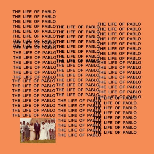
Plain type repeated into a pattern turns a title into the artwork itself.
Symbols
Repeating title
The same words stacked again and again suggest obsession, echo and a project that keeps changing.
Wedding photograph
A vintage wedding photo introduces family and history into an otherwise stark typographic design.
Overlapping blocks
Overlapping columns of text clash in places, mimicking messy drafts and a record still being edited.
Where Sound Meets Image
The album mixes gospel, trap, soul samples and abrupt shifts in tone, and the cover's jumbled repetition mirrors that restlessness. Songs such as Ultralight Beam and Famous move from reverent to confrontational, and the family photograph in the corner touches on the personal themes running through the record. The unfinished look matches a project that kept evolving in public.
The cover pushed text-only, merchandise-like artwork into the mainstream for major rap releases. Its overlapping, flat-color approach was widely imitated and parodied, and it helped make plain typographic designs feel as bold as photography.