Style & Context
Influences
Bauhaus simplicity, confessional album aesthetics, literary restraint
Location
This Brooklyn MC's visual restraint mirrors the gentrified borough's tension between old-school grit and contemporary refinement.
Visual Language
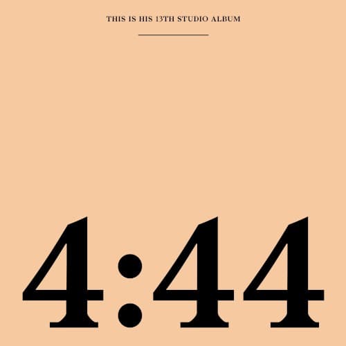
The design borrows from spare modernist principles where absence of ornament becomes its own statement of confidence.
Symbols
4:44 time stamp
References the album's title track, a confessional recorded at 4:44 AM during sleepless introspection and regret.
Colon separator
The punctuation mark functions as a pause, a breath between the twin fours of reckoning and consequences.
Serif typeface
Traditional serif font conveys gravitas and maturity, departing from the sleek branding of previous releases.
Where Sound Meets Image
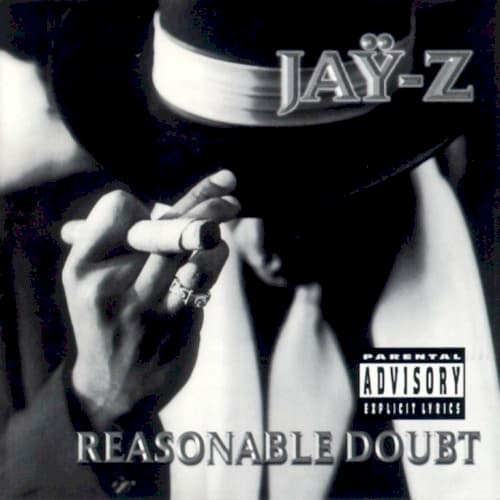
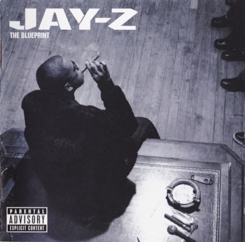
The visual austerity mirrors the album's stripped-down soul samples and confessional lyrics about infidelity, generational wealth, and Black entrepreneurship. Where The Blueprint featured Jay in a suit or Reasonable Doubt showed street glamour, this cover offers no image of the artist at all, matching songs that prioritize introspection over persona. The time stamp visual anchors the project's central theme of accountability moments that arrive in darkness and solitude.
This cover helped normalize anti-design in hip-hop album art, proving that restraint could communicate more than spectacle in the streaming era. Its influence appears in subsequent minimalist releases from Drake, Kendrick Lamar, and others who discovered that blank space could command attention. The design remains a reference point for how mature artists can visually signal artistic evolution without rebranding entirely.