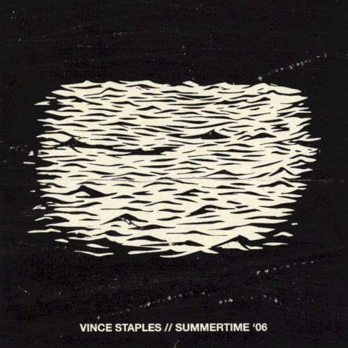
Style & Context
Influences
Minimalist graphic design, punk album aesthetics, surveillance footage grain
Location
Long Beach's Ramona Park appears as psychological landscape rather than backdrop for posturing or celebration.
Visual Language
The deliberate crudeness rejects glossy commercial hip-hop packaging for something closer to zine culture authenticity.
Symbols
Turbulent water surface
The chaotic unpredictability of gang life in Ramona Park constantly threatens to pull you under.
Horizontal bands of waves
Television static mirrors how violence becomes white noise when you grow up surrounded by it daily.
Complete absence of sky
The cover offers no escape or hope, trapping viewers in the same suffocating present Staples survived.
Where Sound Meets Image
The cover's minimal brutality perfectly captures the album's sparse, claustrophobic production and Staples' emotionally detached delivery. Just as the water offers no reflection or depth perception, Staples narrates extreme violence with clinical distance, protecting himself through numbness. The horizontal wave pattern mirrors the album's structure as a double disc that loops through the same traumatic summer from different angles. The absence of Staples' face or body reinforces how the environment consumes individual identity, reducing people to statistics in gang warfare.
This cover helped establish the visual language for hip-hop's shift toward psychological realism and away from aspirational imagery. Its influence appears in subsequent minimalist rap covers that prioritize conceptual depth over commercial appeal. The design proved that post-2010s hip-hop could reject flashy packaging without sacrificing cultural relevance, paving the way for artists like Earl Sweatshirt and JPEGMAFIA to embrace deliberately harsh aesthetics.