Style & Context
Influences
Greek and Roman sculpture, conceptual art, luxury fashion editorials, redacted document design
Location
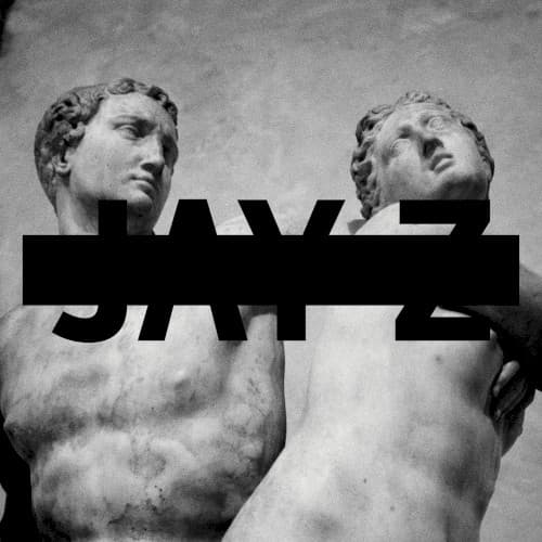
The gallery imagery signals the high-art, wealthy circles Jay Z had entered, far from the Marcy Houses of his early songs.
Visual Language
A rough stone surface meets a clean geometric bar, creating a stark clash of old and new.
Symbols
Classical marble figures
Sculpted bodies in a gallery pose frame Jay Z as a figure worthy of museum display.
Black censor bar
A thick black bar over the name works like a redaction, hiding the star behind the brand.
Cropped statues
Cropping the bodies at the torso makes the sculpture feel like a fragment of a larger monument.
Where Sound Meets Image
The album, with tracks like Holy Grail, Tom Ford and Picasso Baby, is full of art-world and luxury references, so the sculpture fits directly. Opulence mixed with questions about fame and legacy is a recurring theme. The black bar hints at a guarded, selective artist presenting a controlled public image.
The censor-bar design became an easily recognized template for minimalist rap covers where the name is partly obscured. It pushed rap marketing toward gallery-style art direction and conceptual packaging.